Search
Recent comments
- google bias...
15 hours 21 min ago - other games....
15 hours 24 min ago - נקמה (revenge)....
16 hours 24 min ago - "the west won!"....
18 hours 27 min ago - wagenknecht......
19 hours 8 min ago - the game of war....
21 hours 32 min ago - three packages....
22 hours 52 min ago - russian oil.....
23 hours 7 sec ago - crime against peace....
1 day 7 hours ago - why is Germany supporting the ukrainian nazis?....
1 day 8 hours ago
Democracy Links
Member's Off-site Blogs
a new logo failure for a loony country...
Australia’s new wattle logo is a design, storytelling and timing failure
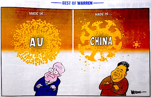
Last week, Australia's new logo was revealed: a golden wattle flower that many were quick to point out bears an uncanny resemblance to COVID-19. As Ash Ivory argues, it wasn't just a design failure, but also a failure to communicate the story behind the logo, and time its launch correctly.
Read more:
- By Gus Leonisky at 7 Jul 2020 - 4:53pm
- Gus Leonisky's blog
- Login or register to post comments

meanwhile in the land of made somewhere else...
This stumped me...
The new one is a covidwattle, scientific name: Covidus yellowbinius pseudoacacia XIX...
Do we live in the dumb country or what???
Cartoon at top in the Daily Telegraph, by Warren Brown... Please note that the Covid19 may have originated somewhere else as well... read: the virus was elsewhere before it emerged in Asia...
a piece of shit...
‘COVID like’ trade logo that cost $10m is quietly ditched...
A golden wattle-inspired logo created to spruik Australian products at international trade shows is being reworked after it was widely mocked for looking like a coronavirus cell.
Trade Minister Simon Birmingham confirmed on Thursday the star burst-like logo, with the letters AU at the centre, was being carefully looked at.
“Obviously, COVID means there’s a need to have a look at that piece of work, particularly the logo element, given some of the associations people were drawing,” he told Sydney radio 2GB.
“A careful look will be had before anything else is done with that in the future.”
The logo was developed – at a cost of $10 million – as part of an overall branding exercise conducted by a business advisory group appointed by the federal government a couple of years ago.
The National Brand Advisory Council is made up of national business leaders, including mining billionaire Andrew Forrest, Glenn Cooper of Coopers brewery (and The Australia Made Campaign) and Australia Post chief executive Christine Holgate.
It finished its work on the replacement logo at the end of 2019.
But when the new design was revealed in all its golden glory in July, there was widespread confusion about its role.
Many wrongly assumed it was intended to replace the green and gold Australian Made logo – and reacted angrily to what they considered an inferior replacement.
Read more:
https://thenewdaily.com.au/news/politics/australian-politics/2020/08/27/...
Having designed a few (dare I say successful) logos in my life... I could give them some adv... Ah bugger it... If the government wants to waste moneys on being stupid in tune with a business advisory group, the morons deserve to be sacked — not being advised on how to suck hard-boiled eggs ... Being reworked? You've got to be kidding...
Read from top.